RJ Market Watch
Not an April Fool’s prank: Tiffany has indeed gone yellow

When the world saw the brand change from its iconic robin blue to yellow on April 1, 2021, most thought of it as an April Fool’s prank. The Retail Jeweller World finds out the truth behind it.
On April 1, people around the world woke up to a strange tweet from Tiffany & Co. The brand name, which Tiffany has had juxtaposed on a beautiful Robin Blue background for years, was changed to yellow. While most people were excited about the new “house” colour, there was also a little bit of skepticism doing the rounds. Retweets and comments on the post were alarmingly high, but the conclusion that was derived was, this was just an April Fool’s prank. Why would the iconic colour go? Of course, it had to be a joke since nobody would dare touch the official trademarked robin’s egg Tiffany Blue color which is more than a brand icon but the brand’s sacred cow.
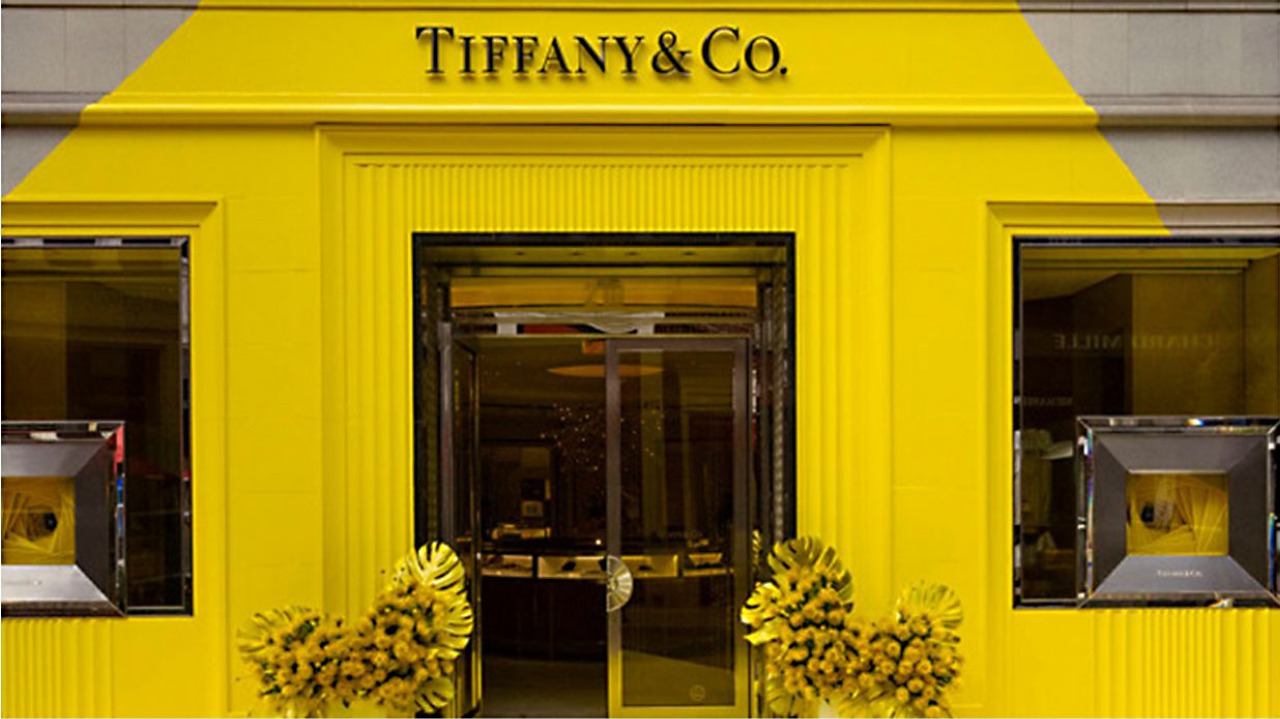
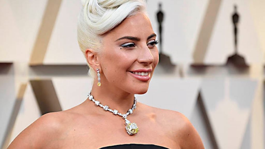
However, it really does seem that Tiffany is taking the “change is the only reality” slogan seriously. The post from Tiffany has already garnered more that 500,000 likes. Tiffany Yellow is indeed a new house color for a popup installation at its Beverly Hills store on Rodeo Drive. Out went the Tiffany Blue color scheme and in came yellow furniture, fixtures, even boxes and bags to showcase a temporary collection of yellow diamond jewelry including the 130 carat “Tiffany Yellow” diamond.

Alexandre Arnault, Tiffany’s new executive vice president of communications and products and son of LVMH CEO Bernard Arnault, said that Tiffany Yellow will get more star treatment in selected stores over the coming year.
No change could have telegraphed so loudly that Tiffany is now under new management with radically new ideas of what the brand can mean. It is the first and most prominent step in the LVMH-izing of Tiffany.
“LVMH is a great marketing machine and after only six months under new management, they touch what for all history has been the untouchable: the Tiffany Blue,” explains Alain Huy, founder of New York-based AH Luxury Consulting and who in a previous life worked for ten years with LVMH.

“It’s about encapsulating the zest for life and the future potential of the brand, rather than conserving the status quo, tradition and the past. LVMH wants to attract the new generation of luxury buyers and yellow looks more vibrant, energetic and playful than the signature blue,” says Dr. Martina Olbert, founder of Meaning.Global and a global authority on brand meaning.
It’s not the first time that LVMH has dared to play with a brand icon. Huy recalls that when Marc Jacobs joined Louis Vuitton as creative director in 1997, he gave the Louis Vuitton logo a color makeover as well, updating the classic brown logo with white, pink, blue, purple and yellow color washes.

For the popup Tiffany installation, the yellow carries a specific story relevant to the brand about yellow diamonds and gold. But it means so much more than just supporting a marketing campaign.
And the change of color, more than any other Tiffany brand asset, is intended to get the most emotional reaction.Besides contrasting so sharply with Tiffany Blue, the bright yellow color communicates life, vitality, optimism and hope after the pandemic cloud the world has been under the past year.
Courtesy: Retail Jeweller World News


You must be logged in to post a comment Login